Hi all, I’m trying to visualize timeseries data on Nilearn’s glass brain. I’m using a preprocessed 4D NIFTI file which contains ~400 volumes. I’m planning to save each volume as its own individual image, after which I’ll stitch together all of the volumes to create a .gif type of animation.
However, this is what I end up with (this is just one sample volume):
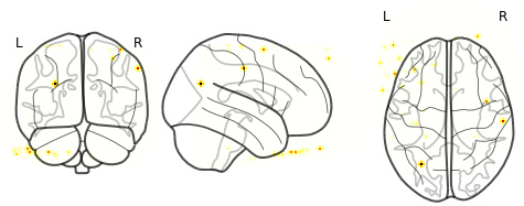
I was expecting it to look more like the images here.
All of the volumes look like this. I’m not sure why I’m not getting bigger swaths of activity (which I do see in FSLeyes). Instead, I’m getting little ‘dots’ of activity. For further context, I’m currently using the EPI file that has not been registered/transformed to standard MNI space (this transformation is currently running). I’m simply using the subject-space image for testing purposes for now.
Here’s my code:
nifti = ‘path/to/preprocessed_4D_EPI’
for volume in image.iter_img(nifti):
[tab] plotting.plot_glass_brain(volume)
plotting.show()
Thank you very much in advance for your help!
Hi,
First of all images need to be in MNI space to correctly overlay on to the background template (your case glass brain).
And, plot_glass_brain is mostly used to visualize statistical maps or brain activations.
Anyway given your interest, I am trying to show how to visualize one volume from pre-processed 4D Nifti image.
from nilearn import datasets
from nilearn import plotting
from nilearn.image import index_img
adhd = datasets.fetch_adhd(n_subjects=1)
func = adhd.func[0]

volume = index_img(func, 0)
plotting.plot_glass_brain(volume)
plotting.show()
Hope this helps.
1 Like
Hi, thanks for your response and help. I understand that images need to be in MNI space (to reiterate, I was in the process of transforming them to MNI space, so I was using the subject-space images for now for testing purposes).
Now that I’ve gotten my images in MNI space, here’s what my visualizations look like:
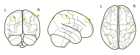
But why are the ‘activations’ localized to small dots? How can I show the larger swaths of activity? I’m not sure how to threshold it. The range of values in the 4D file is around -55 to +55 (acquired via fslstats -r).
Thank you!
This is very strange: the data looks like is it very sparse. I suspect that those images have a bug somewhere.
What happens if you try to do a plot_stat_map?