They definitely do look identical in the line plots, but the values you show in the Excel file are different. My guess is that the xcpd report is showing the wrong time series.
However, I have opened a pull request to fix this: Plot appropriate version of FD in pre- and post-processing figures by tsalo · Pull Request #579 · PennLINC/xcp_d · GitHub. Here is what the updated pre- and post-processing plots look like when using a notch filter from 12 to 18 BPM on test data:
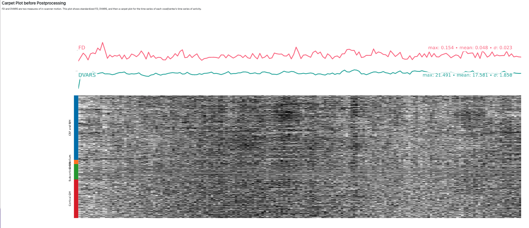
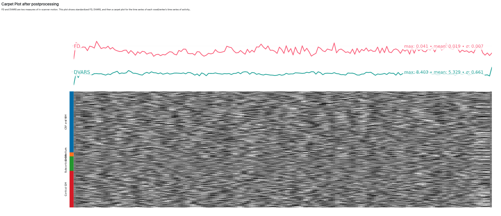
As you can see, in the new version, the filtered time series will be plotted in the post-processing figure, while the unfiltered one will be shown in the pre-processing figure. Hopefully we’ll be able to release the new version by the middle of next week.