Hello everyone,
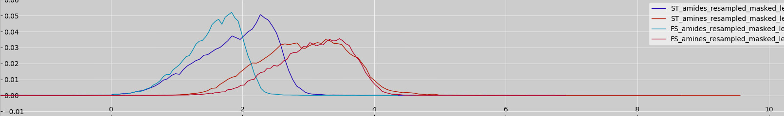
I’m encountering an inconsistency when processing a NIFTI image with FSL tools, and I’d appreciate any insights or suggestions. I am working on a dataset where I segment the glioma region from MR images. I used fslstats to get the range of intensity values within the segmented region, and the command returned: fslstats ST_amines_resampled_masked_lesion.nii.gz -R
-1.956921 9.590046. However, when I visually inspected the same file using fsleyes , the histogram showed peaks around 1 and 4, with essentially no data near the value 9 (I attchecd the histogram images). So, Why might there be such a discrepancy between the fslstats output and fsleyes visualization?
Here is the histogram image.
Thanks