Hi,
I would like to edit .gii files for visualisation purposes, but am really unfamiliar with the format and would greatly appreciate some help.
I conducted some ROI surface analyses on structural MRI data using the CAT12 toolbox. I then did some Bayesian analyses outside of the toolbox, ending up with a Bayes Factor for each ROI of the surface atlas.
I now want to make a surface map that has the Bayes Factors of my analysis in them, instead of the ROI values, to visualise my results. Does anyone have any idea how to do this? When I do this for .nii images, I usually just take the atlas and then replace the ROI values of the atlas with the corresponding Bayes Factors. There is probably a really easy way to do this for .gii files as well, I am just very new to that format and don’t even understand what the different components of surface files are. I know that I could make a colour file where I specify RGB values for each voxel, but I haven’t been able to figure out an automatic way to do this based on my Bayes Factors, so any help or hint would be greatly appreciated.
Thanks,
Kristina
Here’s an R solution: http://mvpa.blogspot.com/2018/06/tutorial-plotting-gifti-images-in-r.html. Not in the post (yet), but you can have R write the images to .jpg (or other image formats) files for use outside knitr.
I haven’t found an R solution for writing giftis, but have from matlab (https://mvpa.blogspot.com/2017/11/tutorial-assigning-arbitrary-values-to.html).
There’s also some ways to visualize .gii files using connectome-workbench. (https://www.humanconnectome.org/software/get-connectome-workbench). To visualize an ROI-wise result the “best” solution would be to write the result into a “.pscalar.nii” file (that hold the ROI label info and the numerical values of your results in one file)
Hey again,
thank you so much, both of you. I got it now. I found these two blog posts really helpful, too.
Thanks again,
Kristina
1 Like
You might also consider using Surfice. You have two options:
-
If your activation regions are in a standard Atlas, you can use the function ATLASSTATMAP. You can either provide this with all your regional instensities (e.g. an array with 189 statistical values if your atlas has 189 areas) or if your sampling is sparse you can list just the regions that are significant (e.g. when only regions 3,5,6 survive and they have intensities 1.2, 2.8 and 2.2 respectively).
-
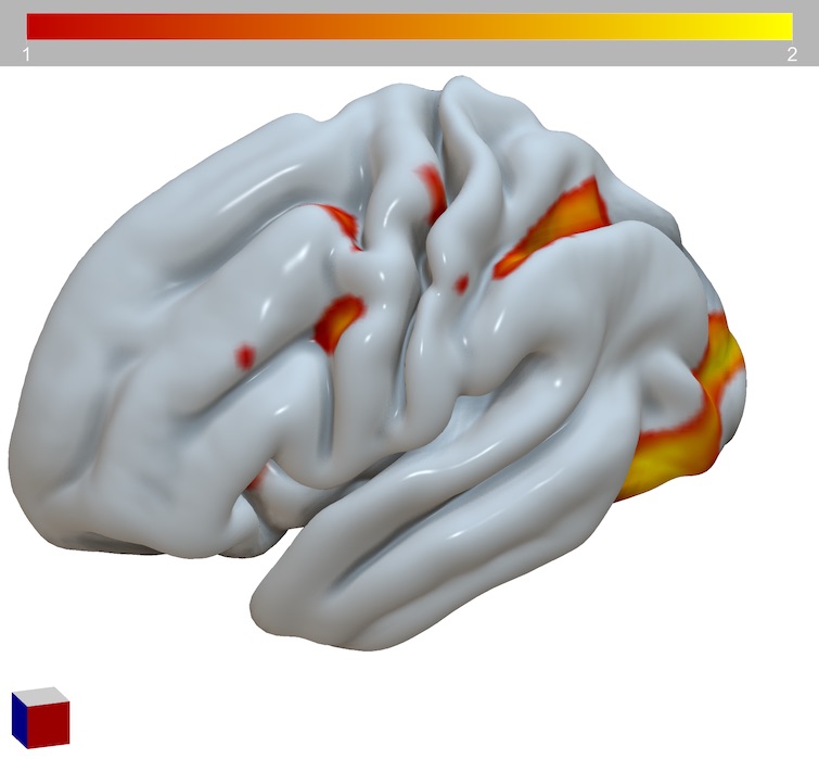
If you have a pscalar.nii or dscalar.nii, you can load this directly. The script below uses the HCP dataset linked in @jaetzel’s tutorial
begin
resetdefaults();
meshload(’/Users/rorden/HCP_S1200_GroupAvg_v1/S1200.L.pial_MSMAll.32k_fs_LR.surf.gii’);
overlayload(’/Users/rorden/HCP_S1200_GroupAvg_v1/HCP_S1200_997_tfMRI_ALLTASKS_level2_cohensd_hp200_s2_MSMSulc.dscalar.nii’);
overlayminmax(1,1,2);
end.
Or if you have Python installed
import gl
gl.resetdefaults()
gl.meshload('/Users/rorden/HCP_S1200_GroupAvg_v1/S1200.L.pial_MSMAll.32k_fs_LR.surf.gii')
gl.overlayload('/Users/rorden/HCP_S1200_GroupAvg_v1/HCP_S1200_997_tfMRI_ALLTASKS_level2_cohensd_hp200_s2_MSMSulc.dscalar.nii')
gl.overlayminmax(1,1,2)
1 Like
Oh cool. That looks really nice, too. I’ll check it out.  Thanks for your help and for sharing.
Kristina