I’ve found a method to label in Nilearn the Rois!
import plotly.graph_objects as go
import pandas as pd
import numpy as np
from matplotlib import colormaps, colors
# Visualize function
def visualize_connectome3(df_sorted, coords, marker_labels, cmap_markers='viridis', cmap_edges='coolwarm'):
# Ensure marker_labels is a list
if isinstance(marker_labels, pd.Index):
marker_labels = marker_labels.tolist()
# Extract unique markers from the top rows
unique_markers = pd.unique(df_sorted[['Marker1', 'Marker2']].values.ravel('K'))
# Filter marker labels and coordinates to only include those in unique_markers
filtered_indices = [i for i, label in enumerate(marker_labels) if label in unique_markers]
filtered_coords = coords[filtered_indices]
filtered_labels = [marker_labels[i] for i in filtered_indices]
# Normalize correlations for color mapping
norm = colors.Normalize(vmin=df_sorted['Correlation'].min(), vmax=df_sorted['Correlation'].max())
cmap_markers = colormaps.get_cmap(cmap_markers)
cmap_edges = colormaps.get_cmap(cmap_edges)
# Create a Plotly figure
fig = go.Figure()
# Add nodes to the plot
fig.add_trace(go.Scatter3d(
x=filtered_coords[:, 0],
y=filtered_coords[:, 1],
z=filtered_coords[:, 2],
mode='markers+text',
marker=dict(size=8, color=[colors.to_hex(cmap_markers(norm(c))) for c in df_sorted['Correlation']]), # Use cmap for node colors
text=filtered_labels,
textfont=dict(color='white', size=13, family="Arial"), # Larger font size
textposition='middle right', # Position labels on the right
name='Markers'
))
# Add edges to the plot
for i, row in df_sorted.iterrows():
marker1 = row['Marker1']
marker2 = row['Marker2']
correlation = row['Correlation']
marker1_idx = filtered_labels.index(marker1)
marker2_idx = filtered_labels.index(marker2)
fig.add_trace(go.Scatter3d(
x=[filtered_coords[marker1_idx, 0], filtered_coords[marker2_idx, 0]],
y=[filtered_coords[marker1_idx, 1], filtered_coords[marker2_idx, 1]],
z=[filtered_coords[marker1_idx, 2], filtered_coords[marker2_idx, 2]],
mode='lines',
line=dict(color=colors.to_hex(cmap_edges(norm(correlation))), width=3), # Use cmap for edge colors
name=f"{marker1} - {marker2} ({correlation:.2f})"
))
# Update layout
fig.update_layout(
title=dict(
text='',
x=0.5, # Center the title
y=0.95, # Move the title slightly up to avoid overlap
font=dict(size=26, color='white', family="Arial")
),
paper_bgcolor='black', # Black background for the entire figure
plot_bgcolor='black', # Black background for the plot area
scene=dict(
xaxis=dict(
title=dict(text='X', font=dict(size=18, color='white')),
showbackground=False,
showgrid=True,
gridcolor='rgba(50, 50, 50, 0.5)', # Dark gray gridlines
showline=True,
linecolor='white', # White axis lines
showticklabels=False,
zeroline=False
),
yaxis=dict(
title=dict(text='Y', font=dict(size=18, color='white')),
showbackground=False,
showgrid=True,
gridcolor='rgba(50, 50, 50, 0.5)', # Dark gray gridlines
showline=True,
linecolor='white',
showticklabels=False,
zeroline=False
),
zaxis=dict(
title=dict(text='Z', font=dict(size=18, color='white')),
showbackground=False,
showgrid=True,
gridcolor='rgba(50, 50, 50, 0.5)', # Dark gray gridlines
showline=True,
linecolor='white',
showticklabels=False,
zeroline=False
)
),
margin=dict(
l=20, # Adjusted margins for better spacing
r=20,
b=20,
t=20
),
width=600, # Width of the plot
height=400, # Height of the plot
showlegend=True,
legend=dict(
x=0.0, # Center the title
y=-0.2, # Move the title slightly up to avoid overlap
font=dict(size=10, color='white', family="Arial"), # White font for the legend
bgcolor='rgba(0, 0, 0, 0)', # Transparent background for the legend
)
)
# Show the plot
fig.show()
# Example usage with 'magma' for markers and 'coolwarm' for edges
# visualize_connectome3(marker_corr.head(3), coords, marker_labels, cmap_markers='magma', cmap_edges='coolwarm')
# 3D Networks
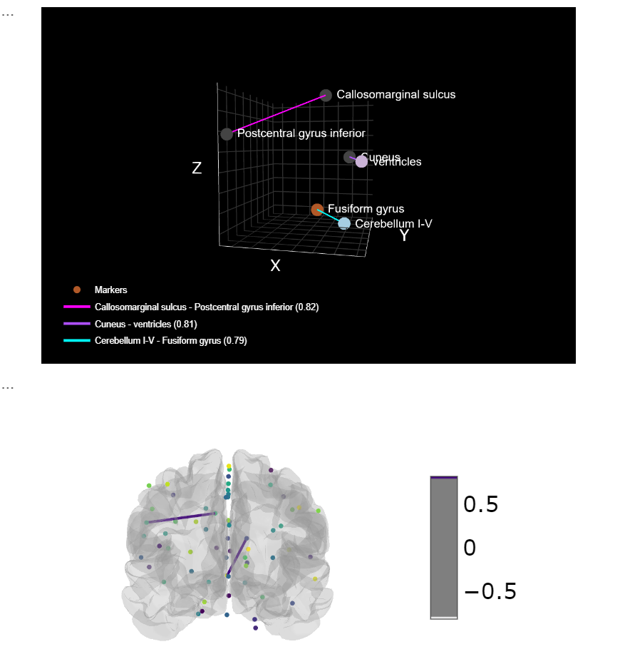
visualize_connectome3(marker_corr.head(3), coords, marker_labels, cmap_markers='Paired', cmap_edges='cool')
plotting.view_connectome(mean_adult_matrix,coords, edge_threshold=0.8,
edge_cmap='Purples', colorbar=True)