Hi @e.urunuela
Congratulations on the new release of RICA - this is a really useful tool!
I have a feature request/suggestion/question… we’re in the middle of performing some manual classification of tedana output and have become quite familiar with the visual representation of where the components are located (using the previous version of RICA).
Would it be possible to keep the option to use the previous visualisation tool (perhaps as a toggle so we can switch between the two methods of showing the data)? Alternatively, would it be possible to change the visualisation to replicate the appearance of the previous tool?
Lastly, if none of that is possible/desirable, is it possible to download and run the old version? Sorry for my lack of familiarity with this.
Best wishes,
Jon
Hi @e.urunuela,
One last suggestion, when selecting a component from the variance explained pie-chart, the component in the list (at the bottom of the page) is automatically highlighted. Where the RICA “pane” is too big to comfortably fit within the visible portion of the webpage this causes the screen to scroll down to show the highlighted entry. This is quite distracting and not that helpful from a useability perspective, as it forces the user to disengage with the visual presentation/spectrum, and scroll back up to bring that back into focus. Short of me (1) buying a bigger screen, or (2) zooming out to make everything tiny, I wonder if it’s possible to disable this behaviour?
Hope this feedback is useful(?), it’s not intended as a criticism of this brilliant tool you’ve built!
Best wishes,
Jon
Thank you for your kind words Jon. I’m sorry this new update has disrupted your workflow.
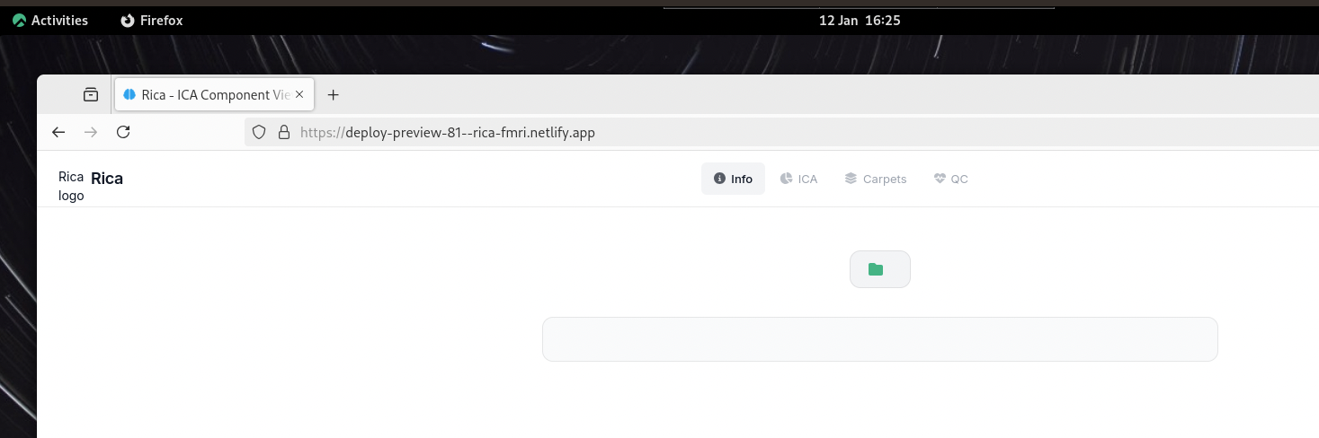
I have just opened a quick pull request with a couple of tweaks that should allow you to work similarly to how you used to. Here is the link you can try: https://deploy-preview-81--rica-fmri.netlify.app/
Let me know what you think, and I can make more changes for it before making the changes public to everyone. Thanks!
Hi Eneko,
Thanks for sharing the updated version with both the interactive and static views, I was wondering if it’s also possible to stop the behaviour I mentioned in the 2nd post - where selecting a new component automatically scrolls the vertical focus of the window to highlight the entry in the list at the bottom of the page (component metrics list). I’m using Firefox (128.9.0esr) running under Rocky Linux.
Thanks,
Jon
Hi Jon,
I took care of it too in this update. You should see there is now that Component Metrics has a little arrow. It means you can click on it to hide the table.
I have made another update to make that more obvious. Let me know what you think! Refreshing the page should update it for you.
Hi Eneko,
Thanks for pointing that out - I had completely missed it. It works perfectly - the pie-chart is easier to navigate, and I’m sure we’ll be making better use of the interactive plots once this current piece of work is done.
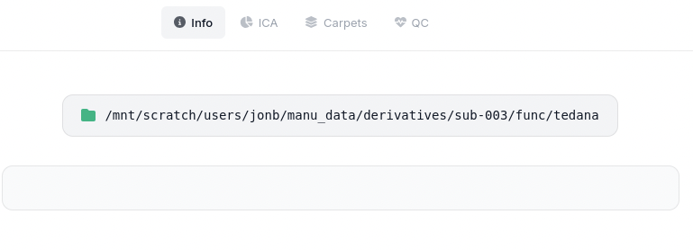
One last thing, when I’ve processed multi-echo data with multiple runs the output ended up in a single folder “tedana” within the derivatives/sub-XXX/func/ parent. When I pointed RICA at this it couldn’t make sense of it all, so I wrote a little script to move the different runs to separate folders. When I select one of these folders and upload for RICA, the info tab is empty.
Is this because I haven’t also moved the associated .tsv file into each folder (e.g. tedana_2026-01-07T172406.tsv)? Or have I broken something else…?
Best wishes,
Jon
Hi Jon,
Yes. it uses the tsv file to populate that page. If it cannot find one of the documents it will show a blank page.
Putting the appropriate .tsv file in the generated sub folder (here it was “pre_run01”) leads to partially complete information:
Could the app just show the single selected folder name instead of the full path?
Another request (sorry). After reclassifying a component it moves it to sit within either team green or team red, visually this is a nice touch, but it makes it quite tricky to see where you’re up to when systematically working through the components. Would it be possible to leave them in place and just change their colour?
The app reads the folder path from the files. Unfortunately, it cannot read your local folder structure (this is a security feature of browser, there’s nothing I can do about it).
I have turned the regrouping off by default and added a button that allows users to turn it on and off. It should remember the user’s preferences.
Thank you so much for your feedback Jon! And I’m so sorry it disrupted your workflow. I will have to think of a better way to help users transition to newer versions.
v2.0.1 is live now with all the features we have discussed here. See changelog here.
Thanks again for all your feedback Jon! I will mark this post as resolved now.
1 Like
Hi Eneko,
Looks good to me - thanks so much for incorporating these changes.
I guess the only suggestion I have is that on the info tab rather than displaying the path to the selected folder, why not display the name of the selected folder - as this is always (?) likely to be more informative than the full path.
Cheers, Jon