Dear Team,
Pardon if my question are so basic!
I have recently trained a Hidden Markov Model (HMM) using fMRI time series data for brain state classification using python. The time series were extracted using the AAL atlas, which contains 116 regions. From this HMM analysis, I obtained group means and covariance matrices, with shapes (6, 116) and (6, 116, 116), respectively—where the 6 represents the number of states.
I would like to visualize these results using Nilearn, and I am seeking your advice on the following:
What is the recommended approach for plotting spatial maps based on these group means and covariance matrices with Nilearn? Could you please give a insight for using the nilearn for this task?
Do I need to ensure that the resolution of the parcellation matches the resolution of the atlas data?
Does the AAL atlas indeed have a default resolution of 2 mm?
Given that AAL is a volumetric parcellation, how should I incorporate this into Nilearn’s visualization functionality?
Any guidance or suggestions you could provide would be greatly appreciated.
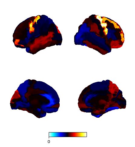
I am sorry, have not seen your reply. actually i have plotted it. but colour scale bar is not showing the maximum and minimum value of group means.
The code i have used is given below:
import numpy as np
from nilearn import datasets
from osl_dynamics.analysis import power

# Load the means array from the specified path
means_path = r"C:\Users\elvin\osl-dynamics\examples\Trials\Trial_9_rest_results\run01\inf_params\means.npy"
means = np.load(means_path)

# Fetch the AAL atlas file
aal = datasets.fetch_atlas_aal()
parcellation_file = aal['maps']

# Calculate the group average of the means (shape: (6, 116))
group_mean = np.mean(means, axis=0)

# Define colorbar limits: symmetric range based on the group mean
vmin = -np.max(np.abs(group_mean))
vmax = np.max(np.abs(group_mean))

# Plot the spatial maps with the defined color scale limits
fig, ax = power.save(
    group_mean,
    mask_file="MNI152_T1_2mm_brain.nii.gz",  # Standard MNI brain mask
    parcellation_file=parcellation_file,       # AAL atlas file
    plot_kwargs={
        "symmetric_cbar": True,
        "vmin": vmin,
        "vmax": vmax,
    },
)
and in the image i cannot see the value of colour bar. its only showing just 0 as the lowest. actually the group means have negative and positive values.
Could help me for this?