Hello,
I’m currently running an fMRI analyses on a set of tasks. First-levels look good, and the beta and t-stats (also generated via fsl randomise) maps at the group-level look fine as well, but the t_correct_p_files, (defined as “T contrast FWE (Family-wise error) corrected p values files.” here) are very strange.
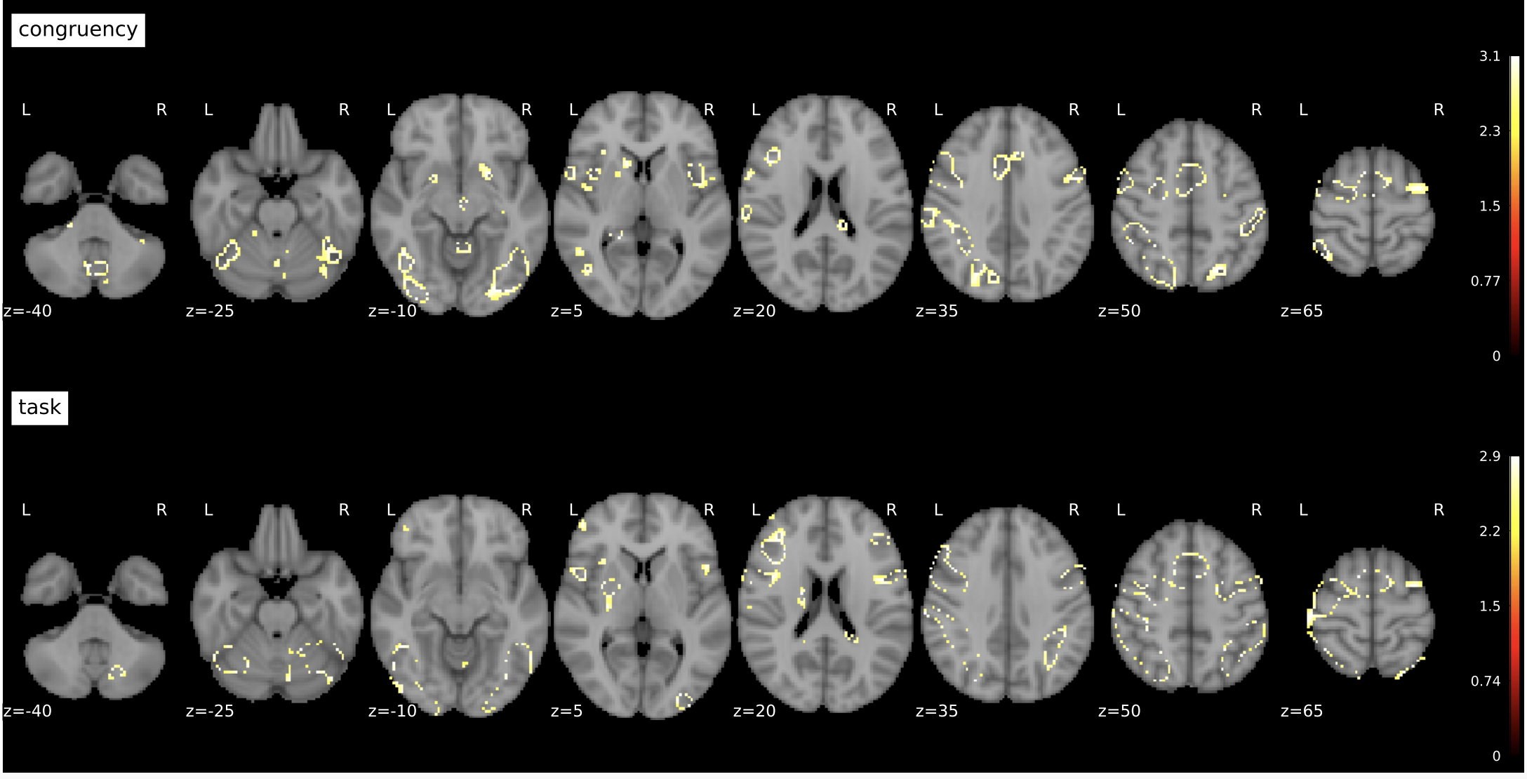
Specifically, the significant voxels are frequently scattered or form donuts, and they don’t align with high values as seen in the beta and t-stats maps.
Example below:

Our code for running randomise is as follows:
from nipype.interfaces import fsl
...
mem = Memory(base_dir=output_loc)
fsl_randomise = mem.cache(fsl.Randomise)
randomise_results = fsl_randomise(
        in_file=concat_loc,
        mask=mask_loc,
        one_sample_group_mean=True,
        tfce=True,
        vox_p_values=True,
        var_smooth=10,
        num_perm=n_perms)

raw_tfile = randomise_results.outputs.tstat_files[0]
corrected_tfile = randomise_results.outputs.t_corrected_p_files[0]
shutil.move(raw_tfile, tfile_loc)
shutil.move(corrected_tfile, tfile_corrected_loc)
A senior lab member said they had strange results using tfce=True, so we tried tfce=False and c_thresh=3.1, and the donuts increased!
Has anyone run into something similar? Or, is there any general guidance on using fsl randomise that I may have missed? Thank you in advance for any suggestions and guidance.
Sincerely,
Henry
