I often use thresholding in plots to quickly visualize results, but I discovered that this can give inconsistent results as shown below. I found that image.threshold_img and glm.threshold_stats_img function similarly and as expected, but the results are different if you threshold directly in plots. The strictest thresholding occurs when you first threshold using threshold_img or threshold_stats_img and then use the same threshold in the plot.
This creates two problems:
- This limits the ability to use plot threshold to plot values below the threshold as transparent and to produce color bars that visually reflect this thresholding.
- Histograms confirm that threshold_img and threshold_stats_img work properly, but plotting these thresholded images gives the appearance of having values below the threshold.
Here’s a reproducible example based on the contrast z-maps produced from this nilearn GLM tutorial.
from nilearn import datasets, image, glm, plotting
import pandas as pd
from nilearn.glm.second_level import SecondLevelModel
from nilearn.glm import threshold_stats_img
n_samples = 20
localizer_dataset = datasets.fetch_localizer_calculation_task(
n_subjects=n_samples, legacy_format=False
)
# Get the set of individual statstical maps (contrast estimates)
cmap_filenames = localizer_dataset.cmaps
# Perform the second level analysis
design_matrix = pd.DataFrame([1] * n_samples, columns=["intercept"])
# specify and estimate the model
second_level_model = SecondLevelModel(n_jobs=2).fit(
cmap_filenames, design_matrix=design_matrix
)
# Compute the only possible contrast: the one-sample test.
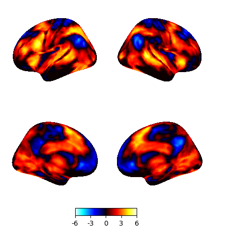
z_map = second_level_model.compute_contrast(output_type="z_score")
plotting.plot_img_on_surf(z_map, surf_mesh='fsaverage5', inflate=True)
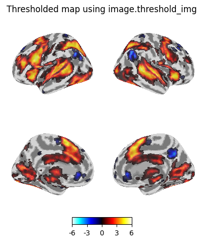
Thresholding using image.threshold_img
Threshold the resulting map without multiple comparisons correction, abs(z) > 3.29 (equivalent to p < 0.001).
thresholded_map0 = image.threshold_img(
    z_map,
    threshold=3.29,
    two_sided=True,
)

plotting.plot_img_on_surf(
    thresholded_map0,
    surf_mesh='fsaverage5',
    inflate=True,
    bg_on_data=True,
    title="Thresholded map using image.threshold_img",
)
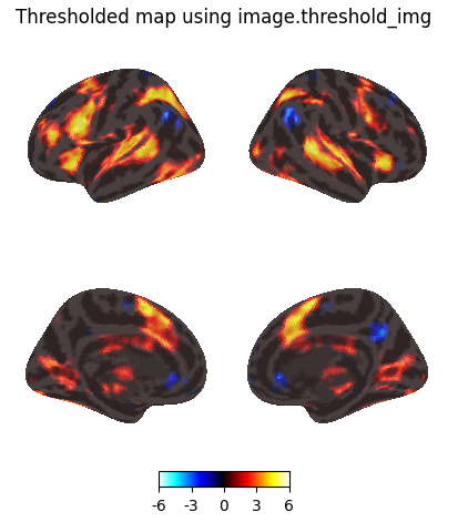
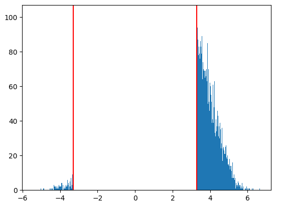
Check the thresholded image using histogram…
import matplotlib.pyplot as plt
import numpy as np

# thresholded data obtained using image.threshold_img
map0_data = image.get_data(thresholded_map0)
map0_data = np.reshape(map0_data, -1)
map0_data = map0_data[map0_data != 0]
plt.hist(map0_data, bins=1000)
plt.axvline(x=3.29, color='red')
plt.axvline(x=-3.29, color='red')
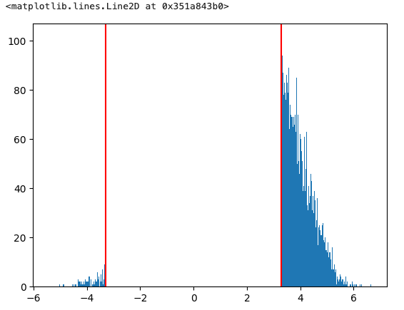
Set plot threshold = 1e-6 to make the zero values transparent. The histogram confirmed that my thresholded image does not contain values below 3.29, but the colour map gives the appearance that I have values below that threshold.
plotting.plot_img_on_surf(
    thresholded_map0,
    threshold=1e-6,
    surf_mesh='fsaverage5',
    inflate=True,
    bg_on_data=True,
    title="Thresholded map using image.threshold_img",
)
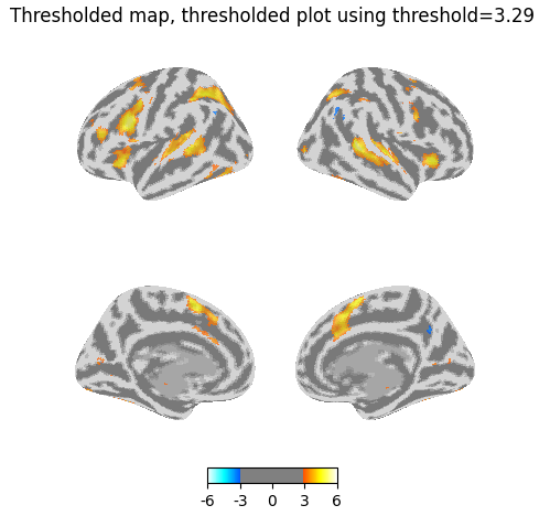
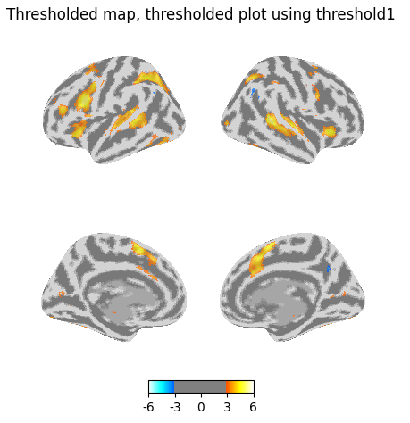
Now I use the threshold of 3.29 in my plot on the previously thresholded map. I’d expect the resulting map to be largely similar, but you can see that many more voxels have been masked.
plotting.plot_img_on_surf(
    thresholded_map0,
    threshold=3.29,
    surf_mesh='fsaverage5',
    inflate=True,
    bg_on_data=True,
    title="Thresholded map, thresholded plot using threshold=3.29",
)
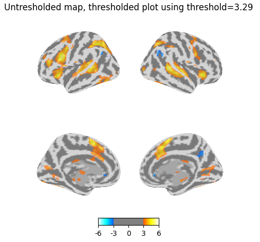
Even weirder, if I threshold the plot but give it the original unthresholded z_map, I get more voxels than the above map (most visibly in the medial view).
plotting.plot_img_on_surf(
    z_map,
    threshold=3.29,
    surf_mesh='fsaverage5',
    inflate=True,
    bg_on_data=True,
    title="Untresholded map, thresholded plot using threshold=3.29",
)
Thresholding using glm.threshold_stats_img
# This is equivalent to thresholding a z-statistic image with a false positive rate < .001, no cluster size threshold to simplify
thresholded_map1, threshold1 = glm.threshold_stats_img(
    z_map,
    alpha=0.001,
    height_control="fpr",
    two_sided=True,
)
print(f"The FPR threshold is {threshold1:.3g}")

plotting.plot_img_on_surf(
    thresholded_map1,
    surf_mesh='fsaverage5',
    inflate=True,
    bg_on_data=True,
    title="Thresholded map using glm.threshold_stats_img",
)
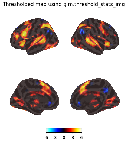
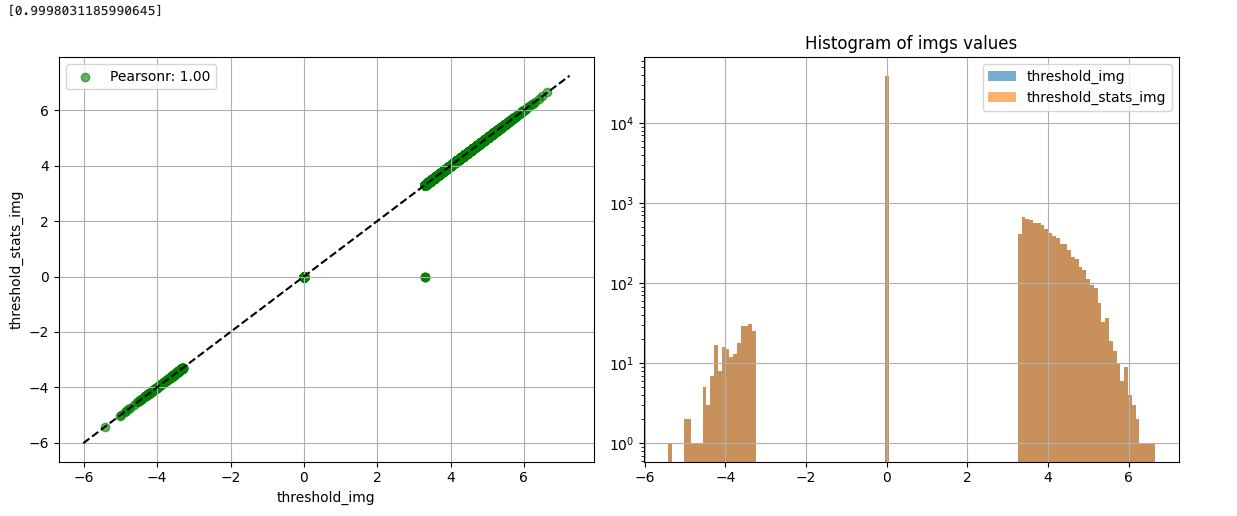
The histogram confirms that this functions as expected, and is comparable to the thresholded image obtained using image.threshold_img.
import matplotlib.pyplot as plt
import numpy as np
map1_data = image.get_data(thresholded_map1)
map1_data = np.reshape(map1_data, -1)
map1_data = map1_data[map1_data != 0]
plt.hist(map1_data, bins=1000)
plt.axvline(x=3.29, color='red')
plt.axvline(x=-3.29, color='red')
plotting.plot_img_comparison([thresholded_map0], [thresholded_map1], second_level_model.masker_, ref_label="threshold_img", src_label="threshold_stats_img")
Now threshold the plot using the same threshold value generated by glm.threshold_stats_img, which again removes additional voxels.
plotting.plot_img_on_surf(
    thresholded_map1,
    threshold=threshold1,
    surf_mesh='fsaverage5',
    inflate=True,
    bg_on_data=True,
    title="Thresholded map, thresholded plot using threshold1",
)
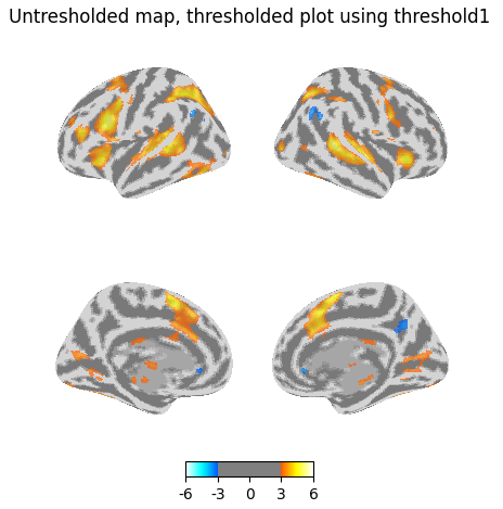
Again I get some of those voxels back if I plot the unthresholded map, but threshold in the plot.
plotting.plot_img_on_surf(
    z_map,
    threshold=threshold1,
    surf_mesh='fsaverage5',
    inflate=True,
    bg_on_data=True,
    title="Untresholded map, thresholded plot using threshold1",
)