I’m trying to use the ggseg package in R for AAL visualization, however the region and label names are uninformative and nondescript, like “lh_LH_region_1” instead of “precentral_gyrus_l”, for example. My team and I have been able to manually label some of them, but it would be helpful if there exists a sort of visual directory so that I can just fill in the gaps manually. Does something like this exist?
I am not sure I quite understand the question or what you mean by visual directory, but you can download the correct version of the AAL atlas that you are using https://www.gin.cnrs.fr/en/tools/aal/ and browse that in your file explorer for more information, there are a ton of files in there.
Thank you for your response! I’ve seen that page before but I will scour it again on your recommendation. To clarify my question though, for the chance that maybe you can think of something else, by visual directory, I mean something that I can look at which actually shows the region labels one by one. Something that just displays the parcellation of the AAL2 atlas (this is the version that I’m using) with all of its regions labeled. In ggseg, the AAL atlas can be mapped but none of the region labels are included so we have no idea what we’re looking at, whereas with something like the dk atlas, you can plot it and all of the region labels are present so you can pinpoint an exact region by name. We’ve been able to label some of the regions manually due to our domain expert, but this method is quite error prone and it would be very helpful if this labeled parcellation already exists and we could simply go through and verify them. Does that make more sense?
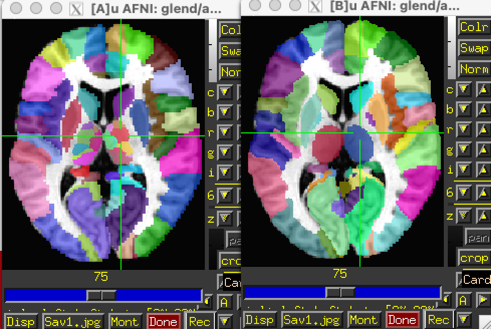
In AFNI, you can view the MacroLabel atlas, which appears to be the same as the earlier version of the AAL atlas. That’s originally from the SPM Anatomy toolbox, but moved to the MNI N27 template space. Here’s a comparison of those two datasets with version 3.1 on the left and the MacroLabels 1.8 version on the right.
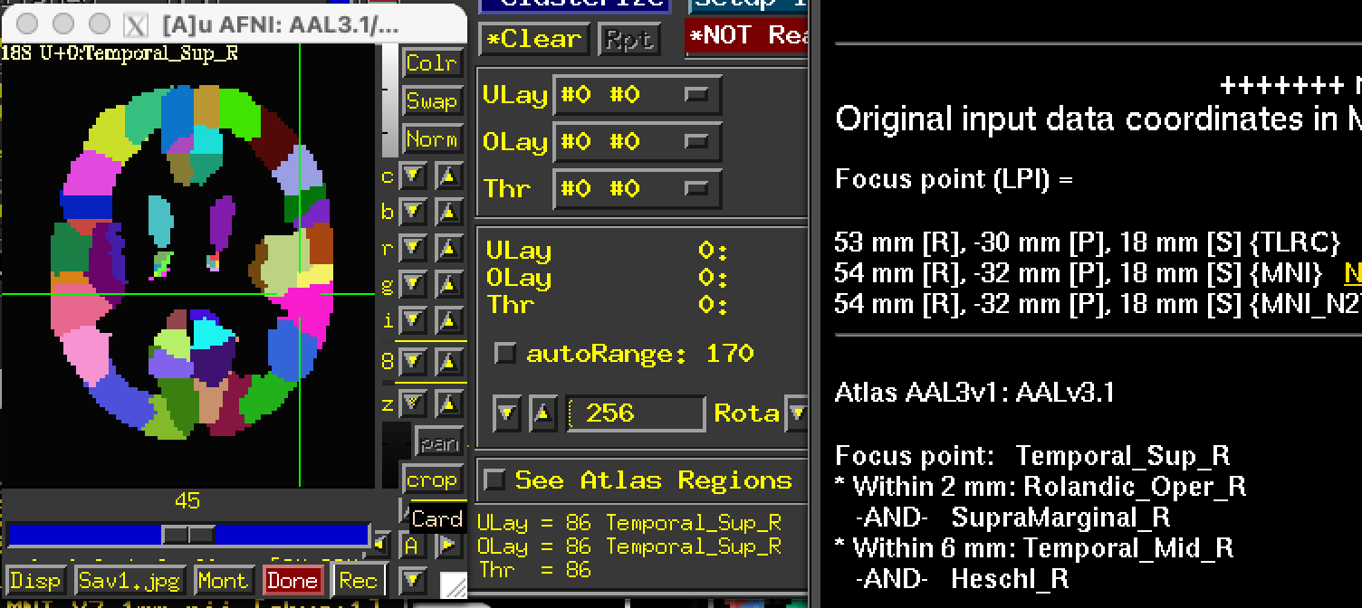
The viewer software controls how labels are shown. In AFNI, this is the “whereami” interface and also as labels in the Overlay panel. There are also “Go to atlas locations” and “Show atlas colors” for particular regions.
I “atlasized” the version 3.1 to have labels integrated into the dataset, but that will be most useful inside AFNI. See the link below to grab that:
https://afni.nimh.nih.gov/pub/dist/atlases/aal/AAL3_dist.tgz
I hadn’t heard of AFNI, thank you so much! This should be very helpful. I’m sure it has the functionality to view the images along the other axes too?
I’m sure it has the functionality to view the images along the other axes too?
Of course.
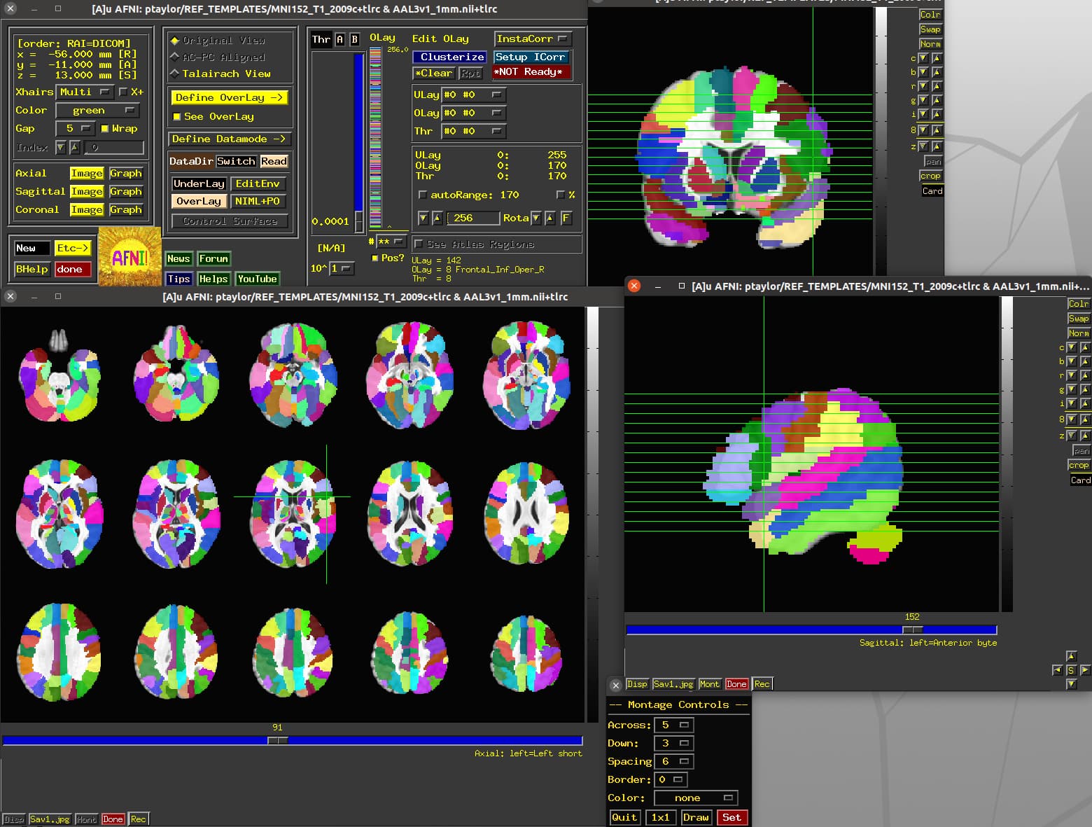
Yes, AFNI can display data along multiple axes, as well as show them as montages:
You can also connect with SUMA visualization, for displaying data on surfaces.
There is a lot of functionality for visualization: interactive clustering, transparent thresholding, instant seedbased-correlation surfing, visualizing time series, drawing on datasets, and more. Here is one playlist of the AFNI Academy YouTube series about visualization:
And here is the GUI guide pages:
https://afni.nimh.nih.gov/pub/dist/doc/htmldoc/afniandafni/main_toc.html
–pt