Dear @Steven , this worked just fine!
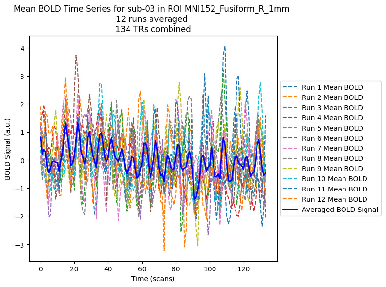
I have adapted the first code you provided. I obtain something like this, averaging all runs for each ROI and each subjects:
import os
import numpy as np
import matplotlib.pyplot as plt
from nilearn.maskers import NiftiLabelsMasker
import numpy as np
from nilearn import image, masking, plotting
from nilearn.image import resample_to_img
import matplotlib.pyplot as plt
import pandas as pd

#------------- Parameters ----------------
data_location = "nilearn_se"
subjects_of_interest = ["02", "03", "04"]  # Example list of subjects
rois = ["MNI152_Fusiform_L_1mm", "MNI152_Fusiform_R_1mm"]  # Example ROIs
#------------- Parameters ----------------

current_directory = os.getcwd()
bids_path = os.path.join(current_directory, '..', f"{data_location}", "bids")
fmriprep_path = os.path.join(current_directory, '..', f"{data_location}", 'fmriprep')
roi_path =  os.path.join(current_directory, '..', f"{data_location}", 'anatomy', 'aal3')
output_dir = os.path.join(current_directory, '..', "results")
print(f"input directory: {fmriprep_path}")
print(f"atlas directory: {roi_path}")
print(f"output directory: {output_dir}")

# Create an empty dictionary to store the mean BOLD signals for each subject and ROI
mean_bold_dict = {}

print("Subjects of interest:", subjects_of_interest)
print("ROIs:", rois)

for roi in rois:
    roi_mask = os.path.join(roi_path, f"{roi}.nii")
    plotting.plot_roi(roi_mask, cut_coords=None,
                          output_file=None, display_mode='ortho',
                          figure=None, axes=None, title=f"{roi}",
                          annotate=True, draw_cross=True,
                          black_bg='auto', threshold=0.5, alpha=0.7,
                          cmap='gist_ncar', dim='auto', colorbar=False,
                          cbar_tick_format='%i', vmin=None, vmax=None,
                          resampling_interpolation='nearest', view_type='continuous',
                          linewidths=2.5, radiological=False)
    plt.show()

# Loop over each subject in the list
for subject in subjects_of_interest:
    subject_func_dir = os.path.join(fmriprep_path, f"sub-{subject}", "func")

    # Get all the functional images (runs) for the current subject
    func_imgs = [os.path.join(subject_func_dir, f) for f in os.listdir(subject_func_dir)
                 if f.endswith("space-MNI152NLin2009cAsym_desc-preproc_bold.nii.gz")]
    func_imgs.sort()  # Sort if needed to make sure they are in the correct order (e.g., run-1, run-2)

    for roi in rois:
        # create the mask based on ROI
        roi_mask = os.path.join(roi_path, f"{roi}.nii")  # ROI mask for the current ROI
        masker = NiftiLabelsMasker(labels_img=roi_mask, standardize=True)

        all_bold_signals = []

        for func_img in func_imgs:
            # Extract the time series for the current run in the ROI
            timeseries = masker.fit_transform(func_img)
            # Compute the mean BOLD signal across all voxels in the ROI for the current run
            mean_bold = np.mean(timeseries, axis=1)
            all_bold_signals.append(mean_bold)

        # Average the BOLD signals across all runs
        mean_bold_combined = np.mean(all_bold_signals, axis=0)

        # Save the averaged BOLD signal in the dictionary, with the key as (subject, roi)
        mean_bold_dict[(subject, roi)] = mean_bold_combined

        # Plot the BOLD responses for all runs and the averaged BOLD response
        plt.figure(figsize=(8, 6))

        # Plot each individual run
        for i, mean_bold in enumerate(all_bold_signals):
            plt.plot(mean_bold, label=f"Run {i+1} Mean BOLD", linestyle='--')

        # Plot the combined (averaged) BOLD signal
        plt.plot(mean_bold_combined, label="Averaged BOLD Signal", color="b", linewidth=2)

        # Customize plot appearance
        plt.xlabel("Time (scans)")
        plt.ylabel("BOLD Signal (a.u.)")
        plt.title(f"Mean BOLD Time Series for sub-{subject} in ROI {roi} \n{len(func_imgs)} runs averaged \n{len(mean_bold_combined)} TRs combined")

        # Move the legend to the right of the plot
        plt.legend(loc='center left', bbox_to_anchor=(1, 0.5))

        plt.tight_layout()  # Adjust layout to make room for the legend
        plt.show()
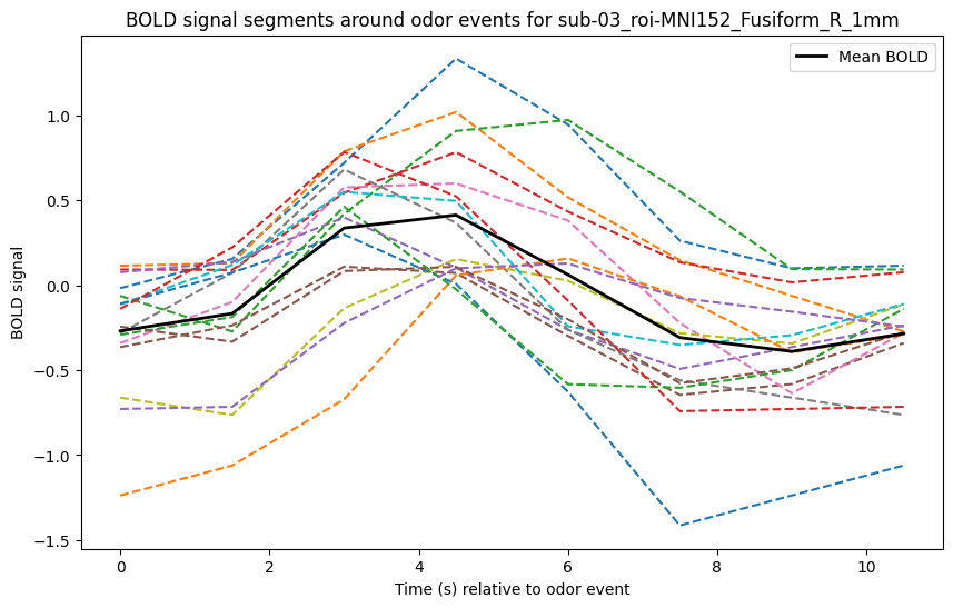
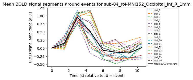
Considering my events onset as t0, I can plot this BOLD relative response for each trials within the averaged curve:
#------------- Parameters ----------------
TR = 1.5                    # Repetition time in seconds
events_frequency = 0.1       # Frequency of events (1 event every 10 seconds)
event_duration = 0.5        # Duration of the event in seconds (500ms)
nb_events = 18              # Number of events
period_duration = 1/events_frequency  # Duration of the period in seconds
#------------- Parameters ----------------

print(f"TR: {TR} s")
print(f"Events frequency: {events_frequency} Hz")
print(f"Event duration: {event_duration} s")
print(f"Number of events: {nb_events}")


# Obtaining time between MRI trigger and first event for each subject
bids_path = os.path.join(current_directory, '..', f"{data_location}", "bids")

events_dict = {}

for subject_folder in os.listdir(bids_path):
    subject_dir = os.path.join(bids_path, subject_folder)

    if os.path.isdir(subject_dir) and 'func' in os.listdir(subject_dir):
        func_dir = os.path.join(subject_dir, 'func')

        for file in os.listdir(func_dir):
            if file.endswith('_events.tsv'):
                events_file_path = os.path.join(func_dir, file)
                events_df = pd.read_csv(events_file_path, sep='\t')

                key = (subject_folder, file)  # key formated as (sub-XX, file)
                events_dict[key] = events_df

mean_delay_mri_trigger = {}

for key, events_df in events_dict.items():
    mri_trigger = events_df[events_df['trial_type'] == 'MRI_trigger']
    odor_events = events_df[events_df['trial_type'].str.match(r'odor.*')]

    if not mri_trigger.empty and not odor_events.empty:
        mri_trigger_onset = mri_trigger.iloc[0]['onset']
        odor_onset = odor_events.iloc[0]['onset']
        time_diff = odor_onset - mri_trigger_onset
        mean_delay_mri_trigger[key] = time_diff
    else:
        print(f"No corresponding events for {key}")

mean_time_diff = round(sum(mean_delay_mri_trigger.values()) / len(mean_delay_mri_trigger), 1) if mean_delay_mri_trigger else 0
mean_delay_mri_trigger["mean_time_diff"] = mean_time_diff
print(f"Mean time between MRI trigger & first event : {mean_time_diff} s")

# adding the "mri trigger" and "odor" events to the BOLD signal dataframes
df_dict = {}

for (subject, roi), mean_bold_data in mean_bold_dict.items():
    print(f"\nCreating df for sub-{subject} in ROI {roi}...")

    time = np.arange(0, len(mean_bold_data) * TR, TR)

    df = pd.DataFrame({
        'time': time,
        'bold': mean_bold_data
    })

    df_key = f"sub-{subject}_roi-{roi}"  # Use a unique key for each DataFrame
    df_dict[df_key] = df

    print(f"Dataframe created and saved in dictionary: df_dict['{df_key}']")

    # Adding the "events"
    df['events'] = np.nan

    # Step 1: Find the closest time to mean_time_diff and mark it as 'MRI_trigger'
    closest_time_idx = (df['time'] - mean_time_diff).abs().argmin()
    df.loc[closest_time_idx, 'events'] = 'MRI_trigger'

    # Set the bold value for the MRI trigger event as the average of the previous and next bold values
    if closest_time_idx > 0 and closest_time_idx < len(df) - 1:
        df.loc[closest_time_idx, 'bold'] = (df.loc[closest_time_idx - 1, 'bold'] + df.loc[closest_time_idx + 1, 'bold']) / 2

    # Step 2: Create 'odor' events at intervals defined by events_frequency
    for i in range(1, nb_events + 1):
        event_time = mean_time_diff + (i * (1 / events_frequency))  # Calculate the event time

        # Find the closest time to the event time
        closest_time_idx = (df['time'] - event_time).abs().argmin()

        # Mark this time as 'odor' and set the bold value as the average of the previous and next bold values
        df.loc[closest_time_idx, 'events'] = 'odor'

        if closest_time_idx > 0 and closest_time_idx < len(df) - 1:
            df.loc[closest_time_idx, 'bold'] = (df.loc[closest_time_idx - 1, 'bold'] + df.loc[closest_time_idx + 1, 'bold']) / 2

# Plotting the BOLD signal segments around the odor events
for key, df in df_dict.items():
    odor_indices = df[df['events'] == 'odor'].index

    segments_bold = []

    plt.figure(figsize=(10, 6))

    for odor_idx in odor_indices:
        segment_end = odor_idx + int(8)
        if segment_end >= len(df):
            break

        segment_time = df['time'][odor_idx:segment_end] - df['time'][odor_idx]
        segment_bold = df['bold'][odor_idx:segment_end]

        segments_bold.append(segment_bold)

        plt.plot(segment_time, segment_bold, linestyle='--')

    # mean
    if segments_bold:
        mean_segment_bold = np.mean(segments_bold, axis=0)
        plt.plot(segment_time, mean_segment_bold, label='Mean BOLD', color='black', linewidth=2)

    plt.xlabel('Time (s) relative to t0 = event')
    plt.ylabel('BOLD signal amplitude (a.u.)')
    plt.title(f'BOLD signal segments around events for {key}')

    plt.legend()
    plt.show()
Not exactly a canonical HRF…
Best,
Matthieu