Hi everyone,
Many of you might be familiar with carpet plots (Power, 2017) as they are also created if you run fmriprep. They are a great way to get an overview of functional MRI images and give also the opportunity to asses the quality of an image.
I was always curious if we perhaps can adapt the carpet plots as proposed by Power and adjust them just a bit to get even more information from a 4D image. I explored some different approaches and would be very curious about your thoughts, ideas, and feedbacks.
I created a detailed notebook that explains the steps I undertook (see here), but let me quickly summarize my different carpet plot approaches.
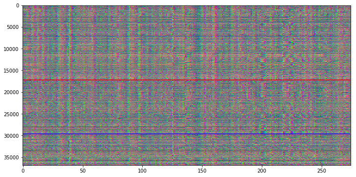
Original Carpet plot
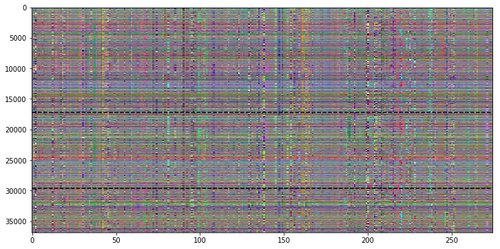
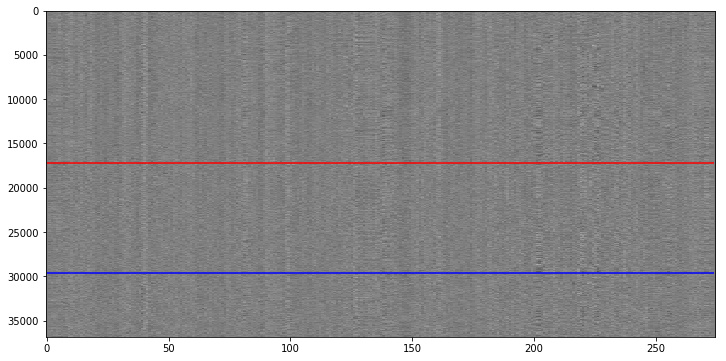
The following is a “standard” carpet plot. Y-axis depicts all the voxels in the fMRI image, and the x-axis shows the timecourse per voxel over all volumes. Voxels above the red line are from gray matter (GM), voxels between the red and blue line are from white matter (WM) and voxels below the blue line are from CSF.
The functional image that we see here was already preprocessed (slice time correction, motion corrected, temporal filter (high-pass of 100s) and spatially smoothed.
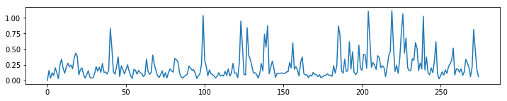
We can see that there is some kind of structure in this carpet plot. This becomes even clearer when we compute the average timecourse over all voxels and compute the 5th power thereof.

Interestingly enough, those spikes are not very strongly related to the FD signal or the motion parameters.
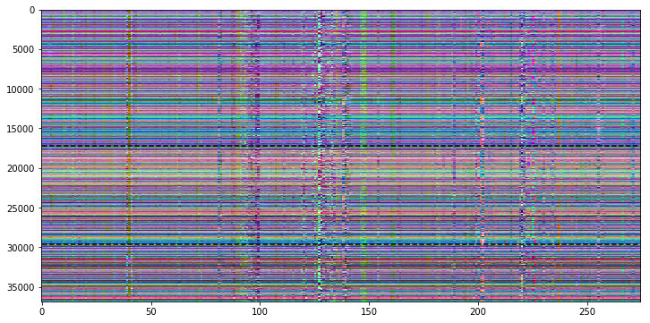
Offset carpet plot
My first idea was to profit from the RGB channels in color images to plot three different information in the carpet plot. Therefore I decided to use R for the original time course, G for a shift of +1 and B for a shift of -1.
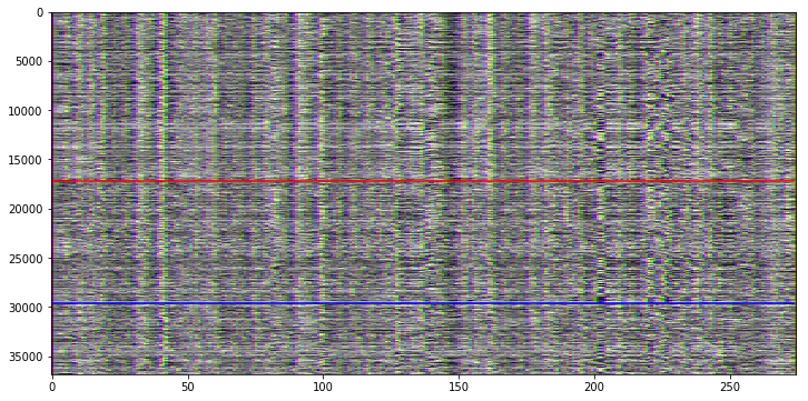
This approach gives us some more information, but it’s actually rather difficult to detect the color information that is hidden in the carpet plot.
Derivative carpet plot
My next approach uses again the RGB channel approach, but this time we’re plotting the original signal (R), the first (G) and the second (B) derivative of the signal.
This is already much easier to understand!
Power spectrum carpet plot
Next, I was curious if we perhaps can get some information from the frequencies hidden in the time course. I’ve computed the power spectral density per voxel. The thinking was that the three different regions (GM, WM, and CSF) should show a different power spectrum.
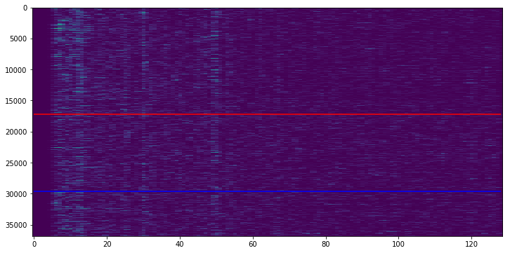
It is difficult to see, but the GM region seems to have a bit higher density of high frequencies when compared to CSF.
PCA carpet plot
Again another approach uses PCA to find additional information in the data. The PCA was fitted on the GM data and the components were then multiplied with the time course of all voxels. The first product of the first three (because of RGB plotting) components is shown in the following carpet plot. The thinking was, that the components top three components in the GM should hopefully be somewhat different from the signal in WM and CSF regions.
ICA carpet plot
The same approach as before, but this time using an ICA.