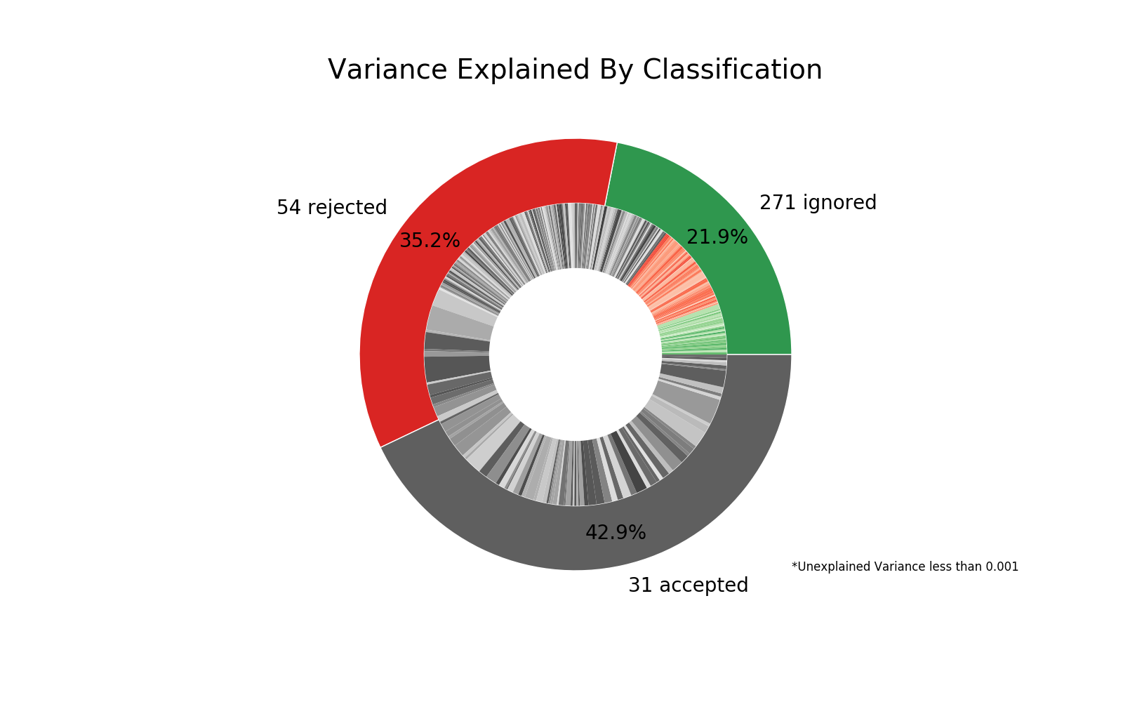
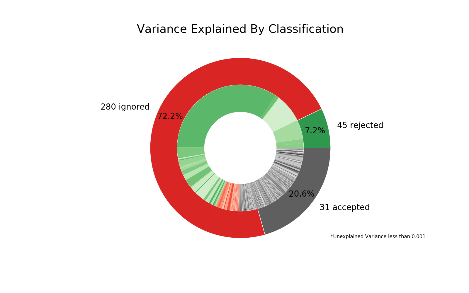
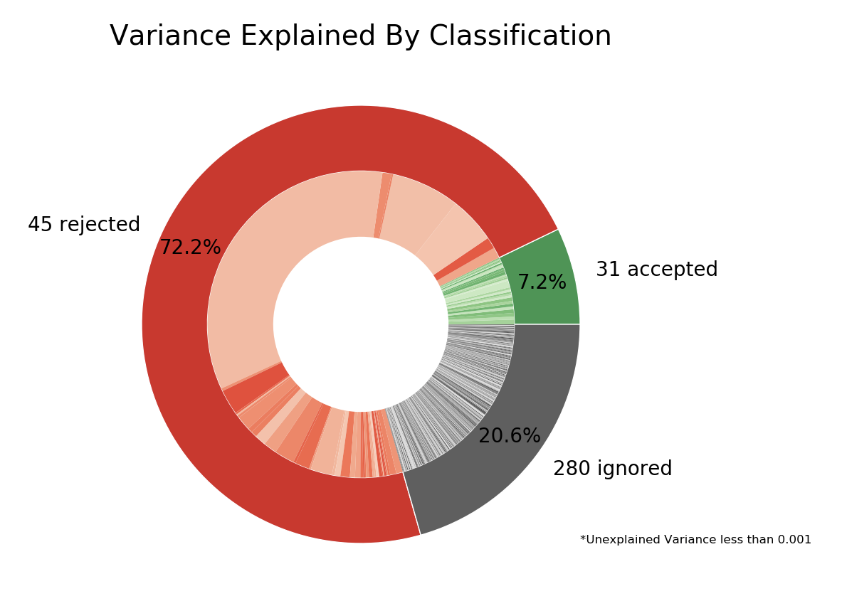
I have run Tedana in order to have denoised optimally combined time series. I have noticed that the double pie chart outputted in the figure folder, although has the right amount of accepted, ignored, and rejected components, does not show them accurately. Colours and rings seem mismatched. I suppose it is nothing to be worried about, but just to make sure I wanted to ask someone else. Has anyone else noticed it before? Please, find attached an example below.
Hey @lollo, thanks for bringing this up. I’m responsible for this figure, so I’ll see if I can sort something out. This is a bug I have never seen before, but hopefully just an issued with visualization.
A few questions - what release of tedana is this, or is it from the latest github version?
Can you send your comp table to me? I believe you can send a direct message here on neurostars.
Do the figures that show time courses, brain maps and FFTs appear to be correct?
I am currently using Tedana 0.0.7, which should be the latest version.
I am replying just today as I re-ran the analysis during the weekend, but I had the same problem.
The other figures look OK, i.e., al the comp_*.png and the Kappa_vs_Rho_Scatter.png. The only one that has mixed rings and colours is the Component_Overview.png one.
Because I do not remember what participant I took the double pie chart from, I will upload another figure and will attach the corresponding comp table. I thought the right thing to do was to tell you even though I am pretty sure it is just a matter of visualisation.
Glad to hear the other figures look alright - I’m assuming that we have encountered some strange edge case or that I missed an update or change. I’ve sent an email, and hopefully we can sort this out.
Clearly there is something strange happening with the ordering, but I am at a loss for what it is. Difficult to dig deeper because I can’t replicate the error - but it does appear to just be a visualization error.