Hello! I’m processing some subject data with QSIRecon (previously processed on QSIPrep as well). I ran DSIStudioGQI workflow and would appreciate some more clarity about the scalar maps outputted in the HTML.
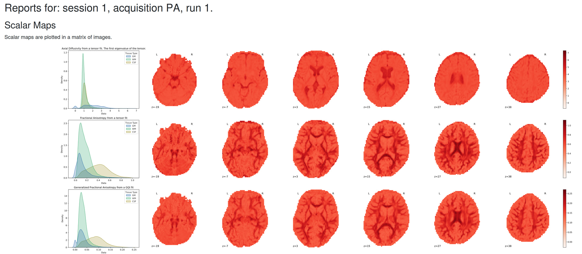
I’ve attached an image for reference. Is this to be expected? I thought that red means there is a mismatch between the gradient directions between the DWI and T1w - so is there something going wrong here? Or am I misunderstanding this figure.
Perhaps I’m misunderstanding your question, but the red in the scalar maps is just showing the value of the scalar. It has nothing to do with the T1w.
Although, it would probably be more helpful if we scale the color bars for better contrast (e.g. bottom out before 0), and use a colormap where brighter means a higher value. WDYT @mattcieslak ?
Also, it does seem odd that in your plots, CSF has the highest FA and GFA, and that GM (not CSF) has the highest AD. Perhaps the tissue compartments are mislabeled. I would guess that CSF would be blue (lowest FA and highest diffusivity), GM would be green (low FA and low diffusivity) and WM would be beige (low diffusivity, high anisotropy).
@Steven Ah okay I understand the scalar maps, I think I confused myself earlier. As for the plots being mislabeled, is this just an error with the HTML? Nothing that’s wrong with how I processed the data?