I think it is important for SDC using topup to have different phase encoding directions, if both images have actually been acquired in that way of course. But as it was mentioned earlier in this thread, the b0 images have also very different intensity between the two acquisitions, perhaps due to the fact that the acquisition parameters are different between the two. For instance, the RepetitionTime for the dwi image is 2.96251 s while it is 5.9 s for the fmap image. This difference of intensity may not help topup either.
It seems like a good approach in that case to switch to the fieldmap-less options mentioned by @Steven and that you are already testing:
For synB0-DISCO, if you wanted to integrate it into the qsiprep workflow, you could be inspired by this discussion:
or by a similar approach for bold images, synBOLD-DISCO and fmriprep, it is basically the same idea:
This explanation and these suggestions/links are really helpful, thank you so much!
Okay. Got it. I will finish this fmapless run, see what it looks like, and perhaps next test out a combination approach of the new fmap (created from fslsplit) + editing the json files to be j and j- + having the same TotalReadoutTimes. It is good to know that those json file edits might still be important even if initially they didn’t appear to do the trick by themselves. If none of these approaches seem to work, I’ll try out synB0-DISCO.
This finished! Yay! And looking at sub-03.html it did actually do syn sdc without fmaps. I uploaded the outputs to another box folder called “19Jan2024SYNFMAPLESS”. What do you think of the outputs? Do you think they look better or usable?
Currently trying this combination approach. I am using the newly created fmap (from the last volume of my “RPE” image), the DW json file PhaseEncodingDirection is j and the “RPE” json file PhaseEncodingDirection is j-, and the DW and “RPE” json files’ TotalReadoutTimes are now the same. Will report back when it’s done!
I just uploaded the outputs to box, in a folder called “20Jan2024COMBO”. I don’t think they look great but I am extremely uncertain and would love to hear your opinion? What do you think?
Oh okay, sounds great! Where might I find those? Are they in derivatives/qsiprep/sub-03/figures/? I’m so sorry, in all my reruns of this subject, I had been deleting some outputs as we went, so crossing my fingers I still have those things.
Oh okay, assuming this is what you were looking for (crossing my fingers that is the case) that was easier than I thought! Thank you so much for explaining. These are all from versions of the sub-03_desc-sdc_b0.svg file in /figures/.
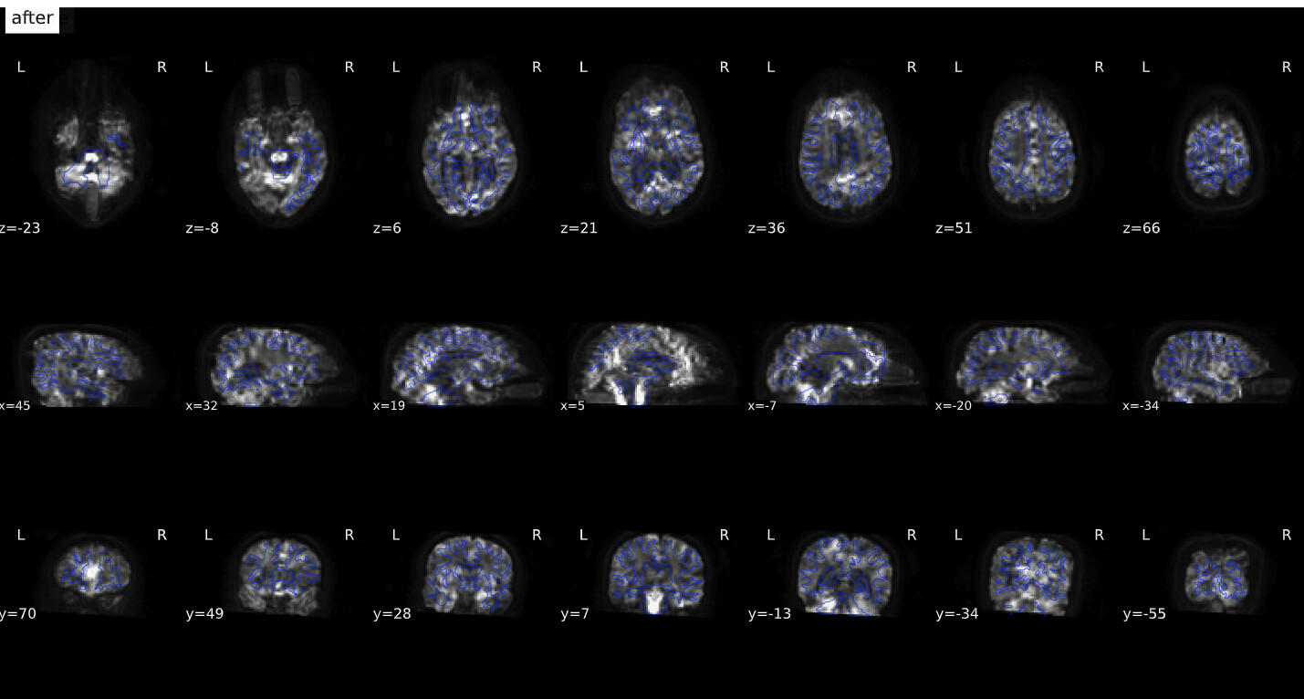
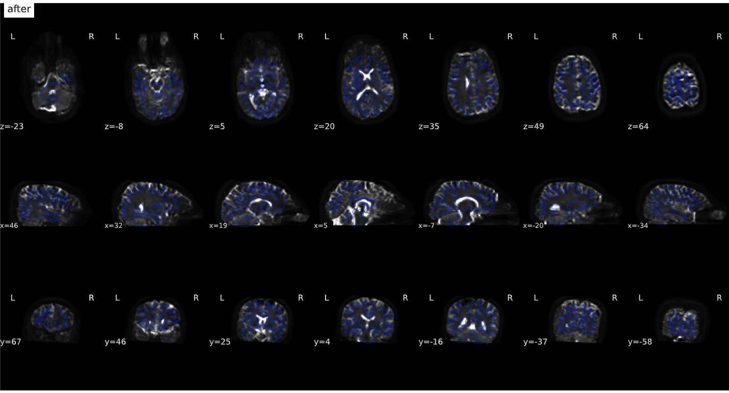
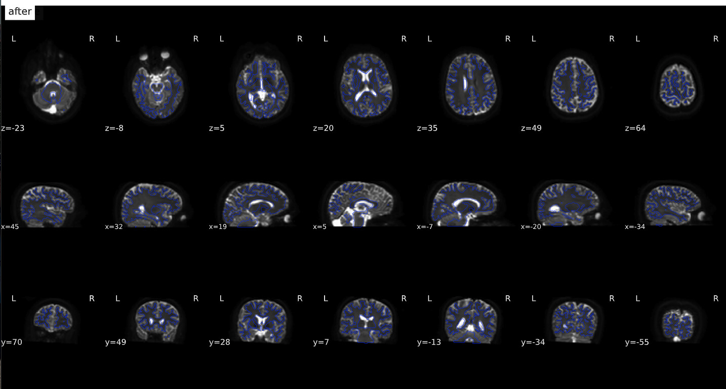
Okay… here we go. I really hope this is more helpful!!
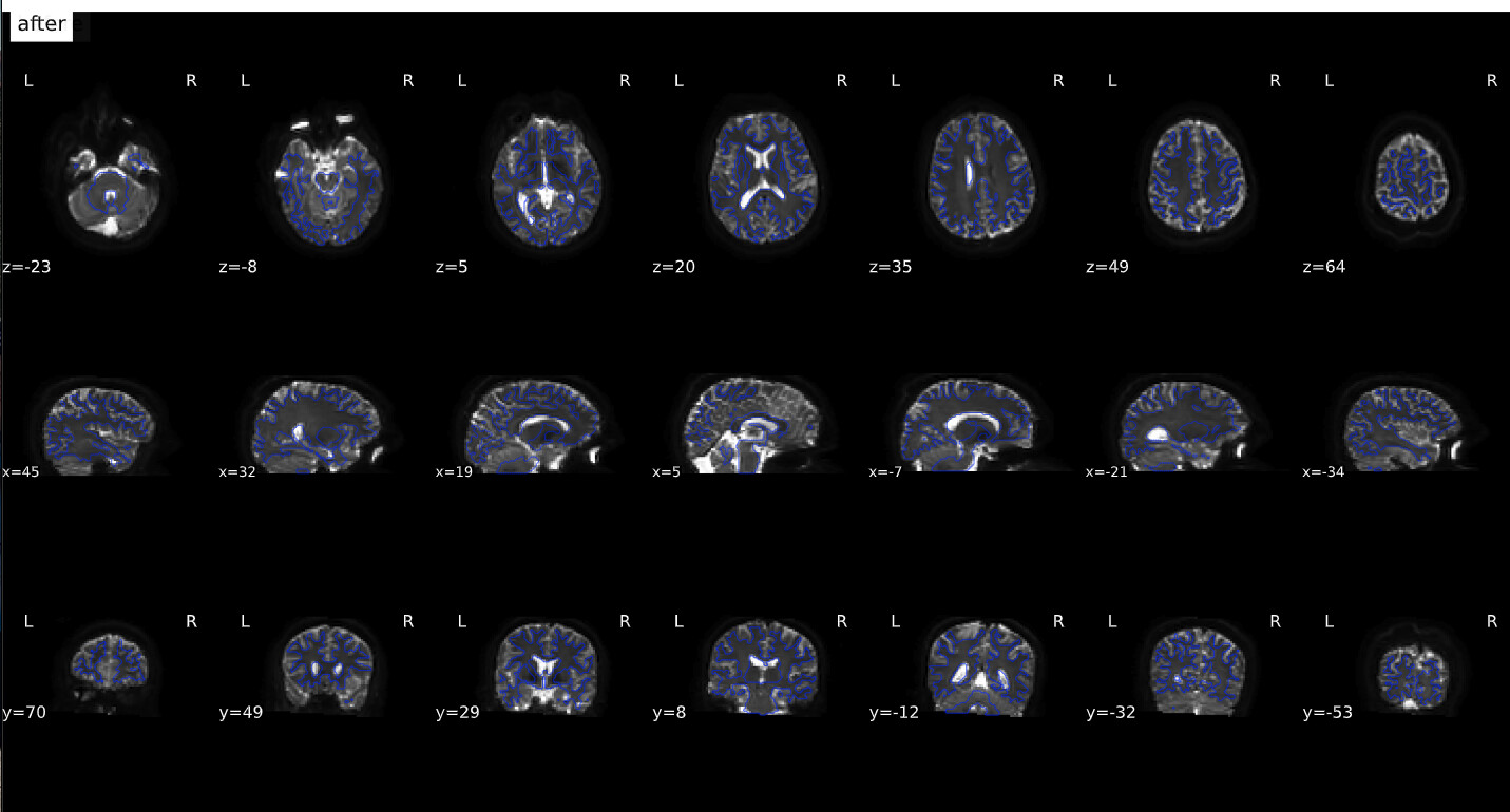
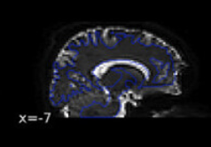
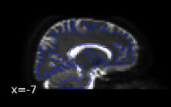
Why didn’t you think they looked okay? Based on the last image, I see good indication that bad warping is being taken care of, e.g., look at the warping near the frontal regions:
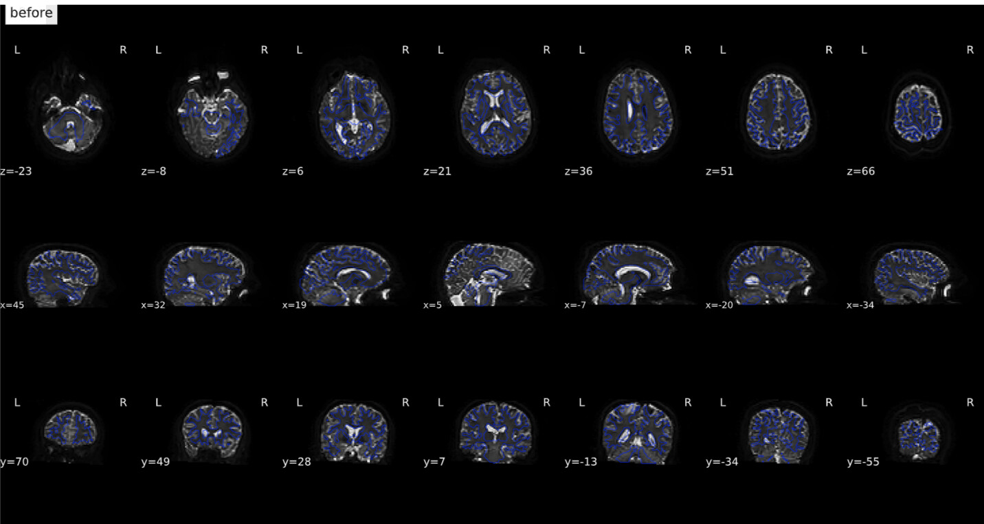
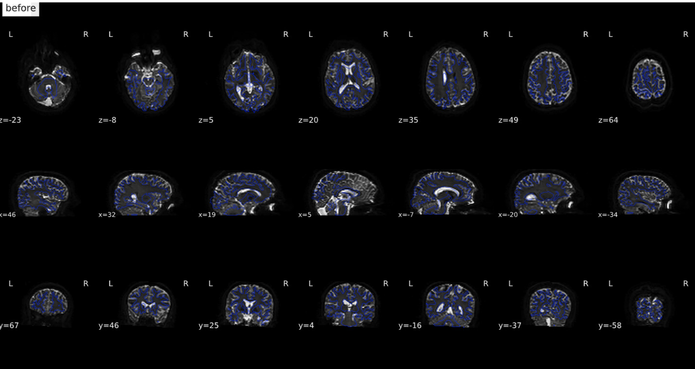
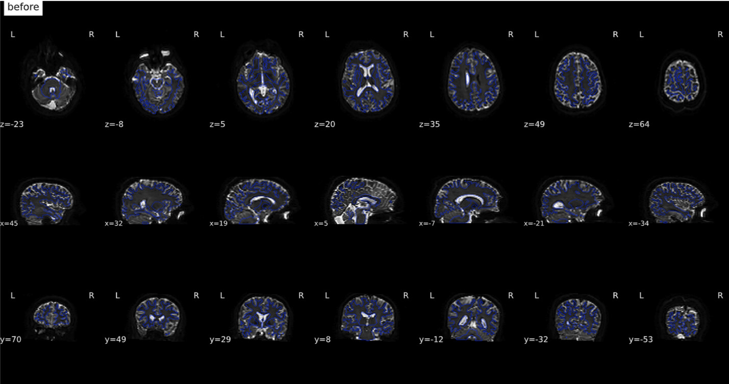
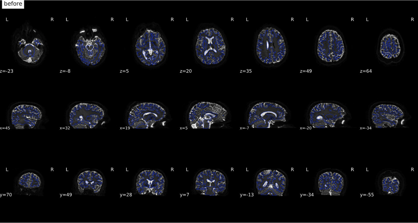
(before)
Based on the images, I think the last one looks the best (with the syn coming in second place). The first two are definitely unusable. One last thing I would check between the last one and the SYN is how they overlap with the T1 image. Overlay the final b0 over the preprocessed T1 and see which one looks the most aligned - judging both by the boundaries of the images and by the locations of known entities (e.g. ventricles). I am going to guess the final image will be best, but still good to confirm.
Amazing! Okay great! Thank you for this assessment! Okay, so based on this, my best approach for these data is using the new fmap (created from fslsplit) and changing one “PhaseEncodingDirection” to be j- and the other j, and making the TotalReadoutTimes the same across the RPE and DWI. Got it. (will definitely check the overlap still though)
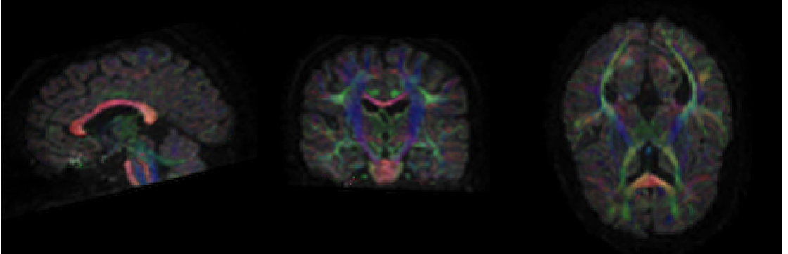
I am still very much so learning and so am very unsure of what looks good and what looks bad (and really am so grateful for your help in deciding), but I had zoomed out to overall image/processing quality and had seen this FA map in dmriprep-viewer from the file sub-03_dwiqc.json and thought it looked bad? Or does it actually look ok?
I usually look at the colorFA RGB map from the dipy DKI recon spec (or by running some other tensor fitting algorithm), overlaid on the T1. I don’t know how dMRIPrep viewer is making those images. But without knowing how those images are made, nothing immediately wrong here. Colors look right (e.g., corpus callosum very red, CST region is very blue, and A-to-P tracts are very green), high FA intensities in places where expected (e.g., corpus and CST).
I agree with @Steven, there’s nothing that stands out as obviously wrong with the results from the last one, and would definitely recommend using real data over syn when possible.
There are some useful metrics in the ImageQC.csv file in the qsiprep derivatives. One check I like to make is whether the t1_neighbor_corr is higher than 0.4. That is a good check that nothing is catastrophically wrong with your data.
This is really awesome to hear. Thank you so much for your input and this confirmation!
Okay, great! It looks like the currently favored combo approach has a t1_neighbor_corr of 0.83331 which is definitely above 0.4 (although that being said all attempts are above 0.4?). Are there any other metrics you like to check in ImageQC.csv? Number of bad slices (t1_num_bad_slices)? Head motion like rotation (max_rotation) or translation (max_translation)? Are there any benchmark numbers for any of these metrics like 0.4 for t1_neighbor_corr? Or, any other quality checks you like to make?
You can see in Table 1 the importance of each QC metric in predicting whether an image would pass manual quality review (i.e., the gold standard). Neighbor correlation was at the top of the list and is likely an index of lots of underlying quality items (such as motion).
I looked at this yesterday and today, and also had a postdoc who does structural imaging also look at the images, and we are actually leaning towards the synthetic fmap looking better, although the combo approach still looks good. Should I still take the combo approach going forward, because using real data is better?